
All About Harvey Balls
Added 26.05.2023Harvey Balls
What Is a Harvey Balls Chart?
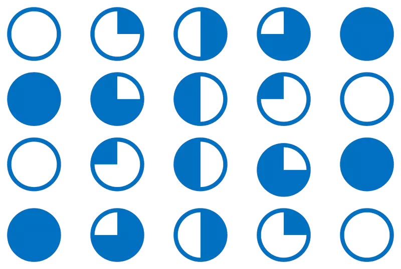
Harvey balls are a visual communication tool used to represent qualitative information in a simple and easy-to-understand manner. They are small circular ideograms that are often used in comparison tables or charts to indicate the level to which a particular item meets a specific criterion.
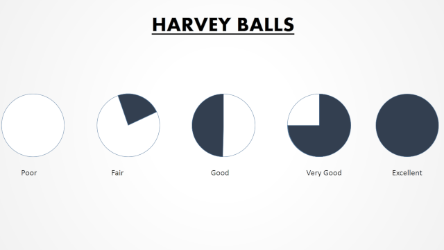
They are typically presented as a set of circles, with the size of the circles indicating the degree to which a particular item meets a criterion, with a fully filled-in circle representing the highest level and an empty circle representing the lowest level. Harvey balls are commonly used to represent various qualitative attributes such as quality, safety, or taste, which are often difficult to summarize in a manner allowing easy comparison.
The use of Harvey balls can help to simplify complex information, allowing individuals to quickly and easily compare and contrast different items or criteria. They are commonly used in fields such as project management, lean manufacturing, and business process modeling software for visualization.
Why Are They Called Harvey Balls?
They are named after their inventor, Harvey L. Poppel, who is generally credited with inventing them in the 1970s while working at Booz Allen Hamilton as head of their worldwide IT consulting practice.

According to some sources, Poppel named the ideograms after himself as a play on words, using his first name "Harvey" and the word "balls" to describe the circular shape of the ideograms. Other sources suggest that the name "Harvey Balls" may have originated from a client of Booz Allen Hamilton who requested a simple and easy-to-understand method of representing qualitative information, and Poppel responded with his invention of the ideograms which were later named after him.
Regardless of the origin of the name, Harvey Balls have become a widely recognized tool for representing qualitative information in a simple and easy-to-understand manner.
How Do You Use Harvey Balls in Excel or Power Point?
To use they, you can follow these steps:
- Download a Harvey Balls font: There are several free and paid options available online, so make sure to choose a font that suits your needs.
- Install the font: Once you have downloaded the Harvey Balls font, you need to install it on your computer. To do this, simply double-click on the font file and click the "Install" button.
Excel
- Create a new Excel worksheet: Open Microsoft Excel and create a new worksheet.
- Insert a new column: Click on the column header to select the entire column. Then, right-click on the column header and select "Insert" to create a new column.
- Change the font: Select the cells in the new column where you want to insert Harvey Balls. Then, change the font of the cells to the Harvey Balls font that you installed in step 2.
- Type in the Harvey Balls: In the cells where you want to insert Harvey Balls, type in the letter corresponding to the level of the Harvey Ball that you want to use. For example, if you want to use a ball that is 75% filled in, type in the letter "w". There are typically several letters or characters available for each level of Harvey Ball.
- Format the cells: Once you have typed in the Harvey Balls, you can format the cells to change the color, size, or other formatting options as needed.
- Save and share your worksheet: Finally, save your Excel worksheet and share it with others as needed.
Power Point
- Create a new PowerPoint slide: Open Microsoft PowerPoint and create a new slide.
- Insert a text box: Click on the "Insert" tab in the ribbon menu, and select "Text Box". Click and drag on the slide to create a text box.
- Change the font: With the text box selected, change the font of the text box to the Harvey Balls font that you installed in step 2.
- Type in the Harvey Balls: In the text box where you want to insert Harvey Balls, type in the letter corresponding to the level of the Harvey Ball that you want to use. For example, if you want to use a ball that is 75% filled in, type in the letter "w". There are typically several letters or characters available for each level of Harvey Ball.
- Format the text box: Once you have typed in the Harvey Balls, you can format the text box to change the color, size, or other formatting options as needed.
- Copy and paste the text box: Once you have formatted the text box with the Harvey Balls, you can copy and paste it to other slides or locations in your PowerPoint presentation as needed.
Pros and Cons of Using Harvey Balls
Pros
- Visual representation of qualitative data: Harvey Balls provide a simple and intuitive way to represent qualitative data, making it easy to compare different categories at a glance
- Easy to use: Harvey Balls are easy to use, even for those without advanced data visualization skills. They can be added to documents or spreadsheets with just a few clicks.
- Customizable: Harvey Balls can be customized to match the branding or color scheme of your organization, making them a great tool for creating professional-looking documents.
- Versatile: Harvey Balls can be used in a variety of contexts, including project management, business process modeling, and value stream mapping.
Cons
- Limited range: Harvey Balls are best suited for representing data that falls into a limited number of categories. They may not be as effective for representing data with a wide range of values or levels.
- Subjective: The degree to which a Harvey Ball is filled in is subjective and open to interpretation, which can lead to inconsistent results if different people are filling in the Harvey Balls.
- Lack of precision: Harvey Balls are a qualitative tool, which means they are not precise enough to provide a detailed analysis of the data.
- Limited to single criteria: Harvey Balls are designed to represent a single criterion or attribute at a time. They may not be as effective for representing multiple criteria or attributes simultaneously.
What Can I Use Instead of Harvey Ball Chart?
If you're looking for alternatives to Harvey Balls for visualizing qualitative data, there are several options to consider, including:
- Bar charts or column charts: These charts can be used to display the differences in quantitative data. You can use different colors for each bar or column to represent different qualitative categories.
- Pie charts: These charts can be used to show the relative proportions of different categories. You can use different colors for each slice of the pie to represent different qualitative categories.
- Heat maps: These charts use colors to represent different levels of intensity. You can use different shades of a color to represent different qualitative categories.
- Radar charts: These charts use a spiderweb-like graph to compare multiple variables across different categories. You can use different colors for each line or shape to represent different qualitative categories.
- Icon arrays: These charts use a grid of icons or symbols to represent different categories or levels. You can use different icons or symbols for different qualitative categories.
Ultimately, the best chart type to use will depend on the specific data you are trying to visualize and the message you want to convey. It's always a good idea to experiment with different chart types and see which one works best for your data.