LivingCharts is a data visualization tool
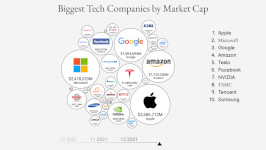
Make a Bar chart race, a Line chart race, an Animated bubble chart, or an Animated pie chart from your data and export it to a video.
Main features
Examples
Click on the project to see a demo of how it works. Click here for more.


Popular Questions
What Is a Bar Chart Race?
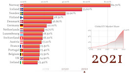
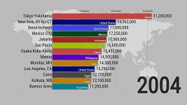
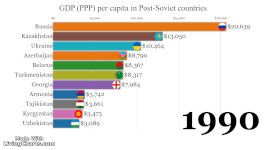
A bar chart race is a type of data visualization that shows changes in the relative sizes of categories over time through a dynamic animation. It consists of a series of horizontal bars that represent different categories, such as countries, industries, or products, and the length of each bar corresponds to the value of a specific variable, such as revenue, population, or market share.
In a bar chart race, the bars move horizontally across a timeline to show how their lengths change over time. Typically, the bars are sorted from largest to smallest at the start of the animation and are reordered as they shift position throughout the visualization. This allows the viewer to see how the relative sizes of different categories evolve over time, which can be useful for understanding trends, patterns, and shifts in data.
How to Make?
Making a bar chart race involves several steps, which I'll outline below:
- Choose your data: Identify the data that you want to visualize. This could be anything from sales data to population statistics to social media trends. Make sure your data includes a time element, such as years, months, or weeks, so you can show changes over time.
- Prepare your data: Once you have your data, you may need to clean and format it for visualization. This could involve removing duplicates, renaming columns, and converting data types.
- Choose your tool: There are many software tools and programming languages that can be used to create bar chart races, including Excel, Python, and JavaScript. LivingCharts.com allows you to create a chart quickly and without programming.
- Create your chart: You may need to import your data or enter it manually. Once your data is loaded, you'll need to create a bar chart and configure the animation settings.
- Customize your chart: you can customize it further by adding labels, titles, and annotations. You may also want to adjust the colors, fonts, and other visual elements to make the chart more appealing and easy to read.
- Export and share your chart: Once you are happy with your result, you can export it as a video or an embedded code.
What Is a Bar Chart Most Suitable For?
A bar chart is a type of chart that is most suitable for visualizing categorical data, which is data that can be organized into distinct groups or categories.
Here are some examples of situations where a bar chart would be a suitable choice:
- Comparing sales data for different products or services
- Analyzing survey responses by different age groups or genders
- Showing the distribution of income or education levels across a population
- Visualizing the frequency of different types of crimes in a city or region
- Comparing the popularity of different social media platforms over time
What Graph Is Best for Race?
A bar chart race is a type of graph that is specifically designed to show changes in data over time.
While there are other types of graphs that can be used to visualize changes over time, such as line charts or area charts, a bar chart race is generally the best choice when you want to focus on comparing categorical data. Line charts are better suited for continuous data, while area charts can be more difficult to interpret when there are multiple categories or when the data is stacked. A bar chart race, on the other hand, allows you to clearly see the relative sizes of each category at each point in time, making it a great choice for visualizing trends and patterns over time.


